Verde Brisa
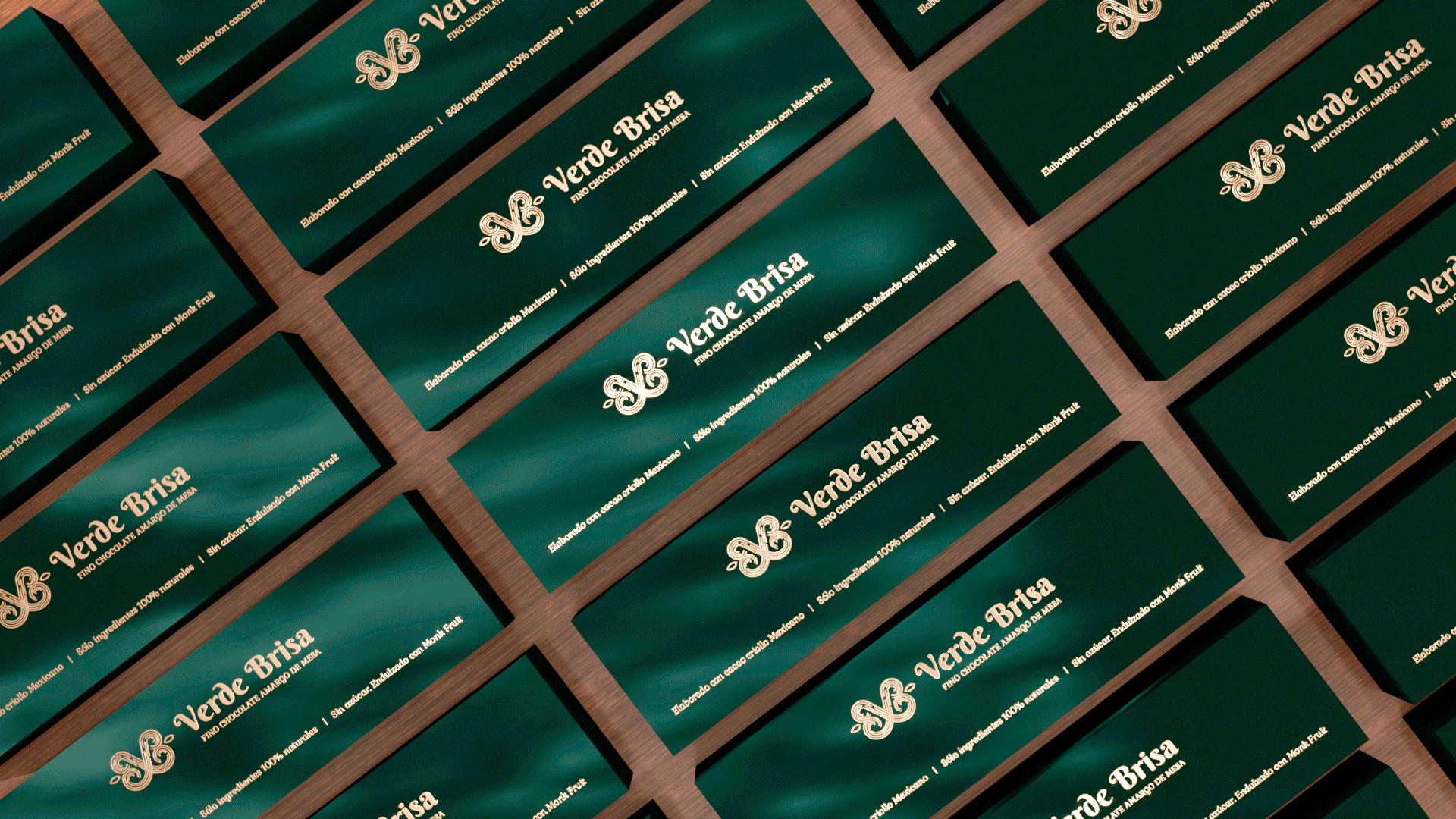
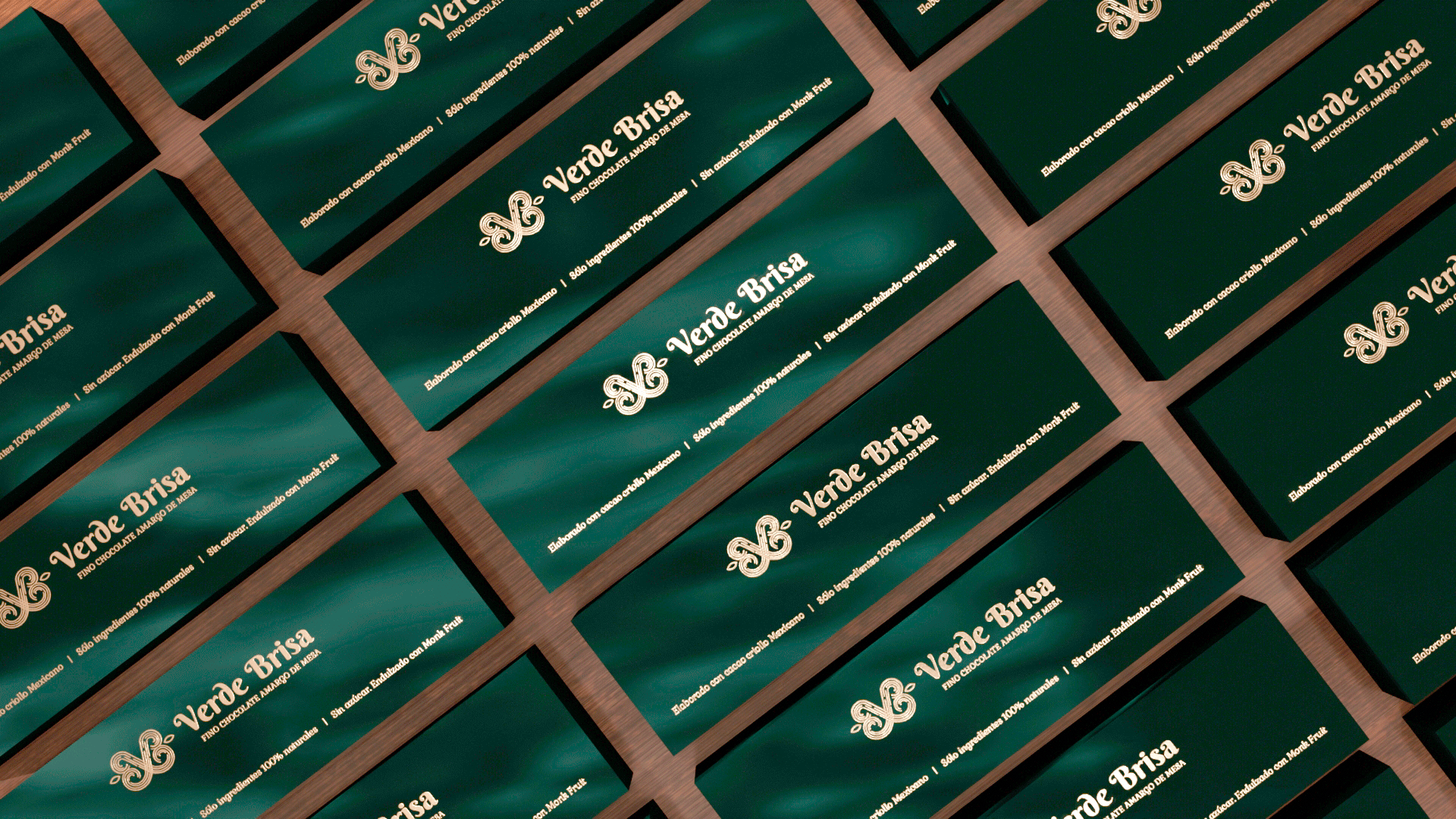
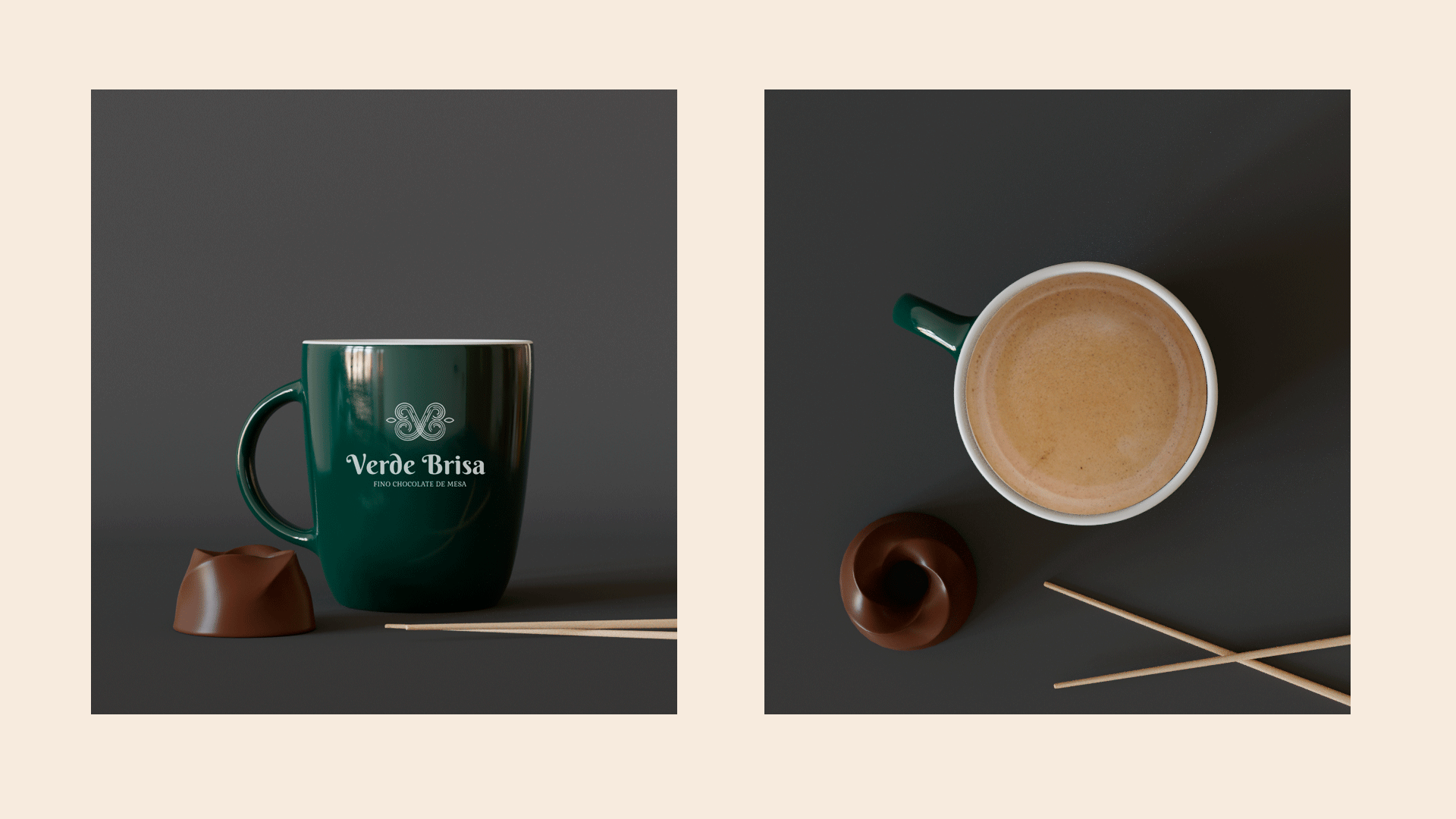
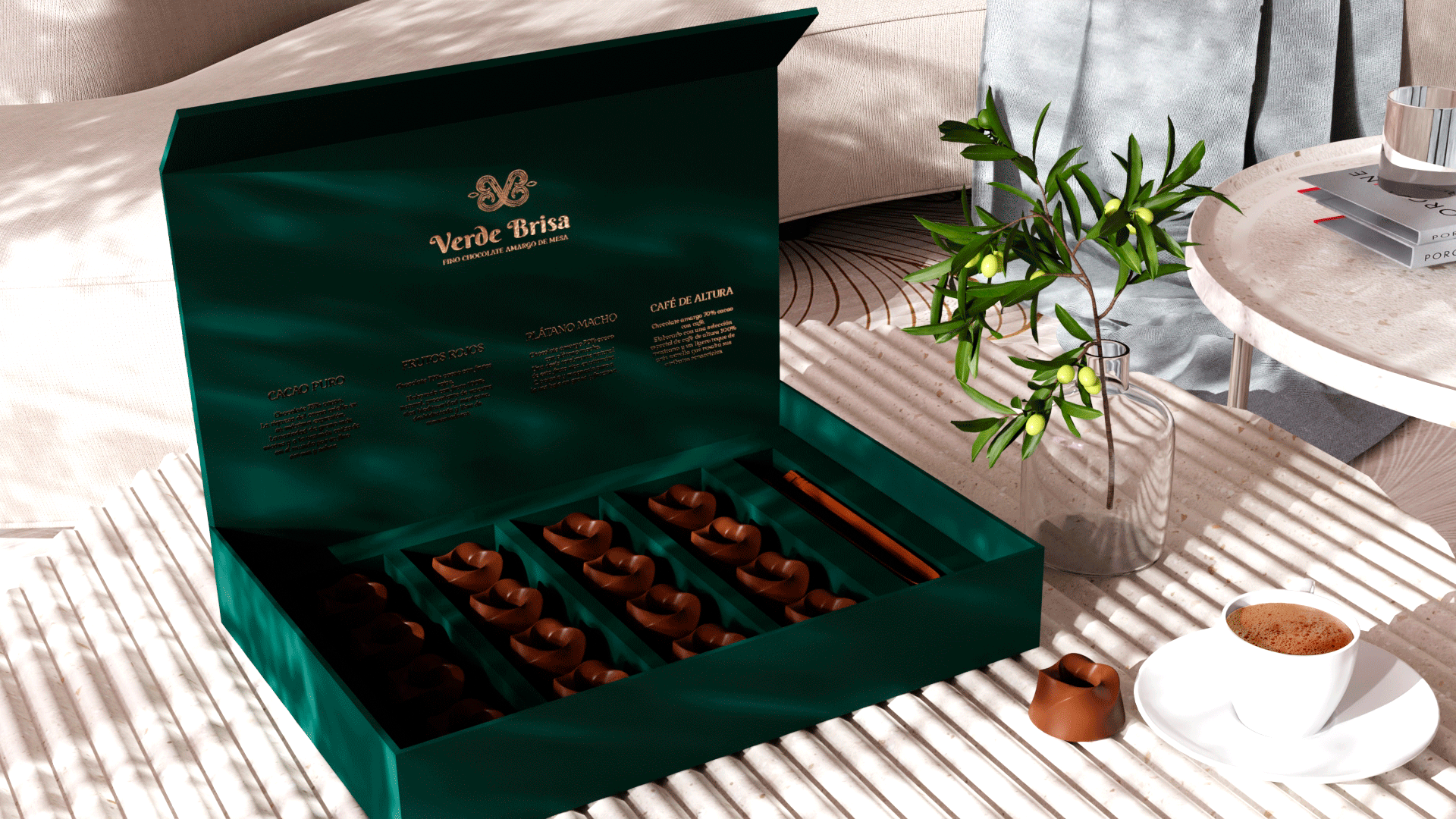
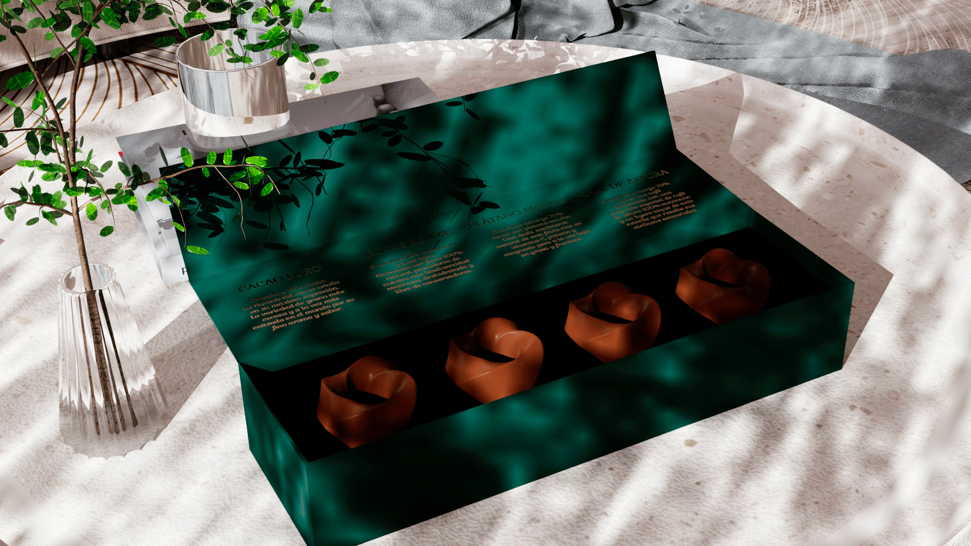
Brand identity and packaging for Verde Brisa, a Mexican artisanal table chocolate brand. A visual system that honors the sacred origin of cacao and positions it for the luxury market.
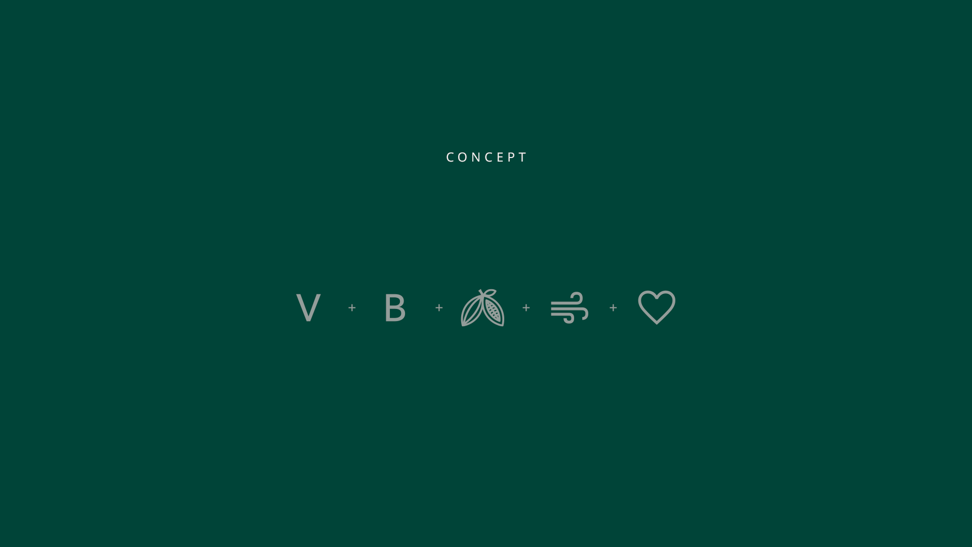
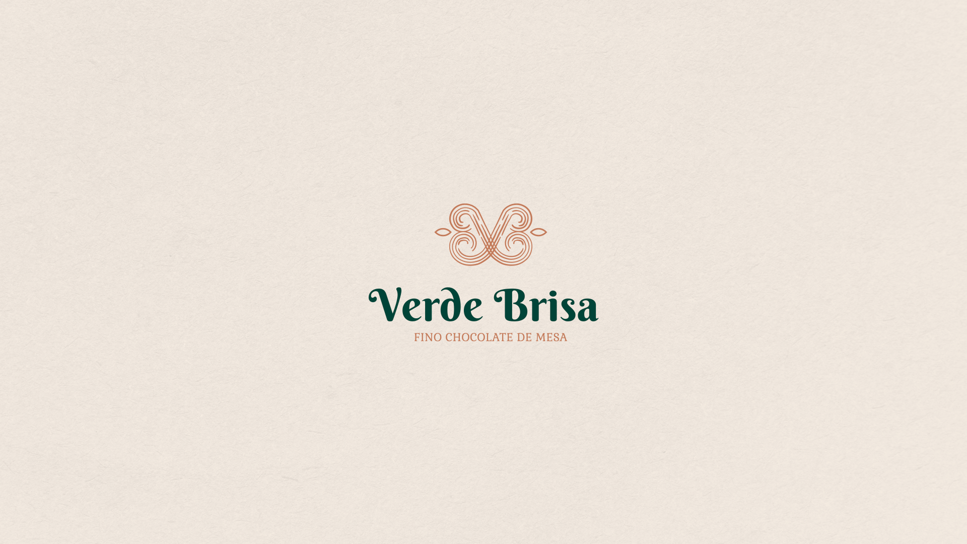
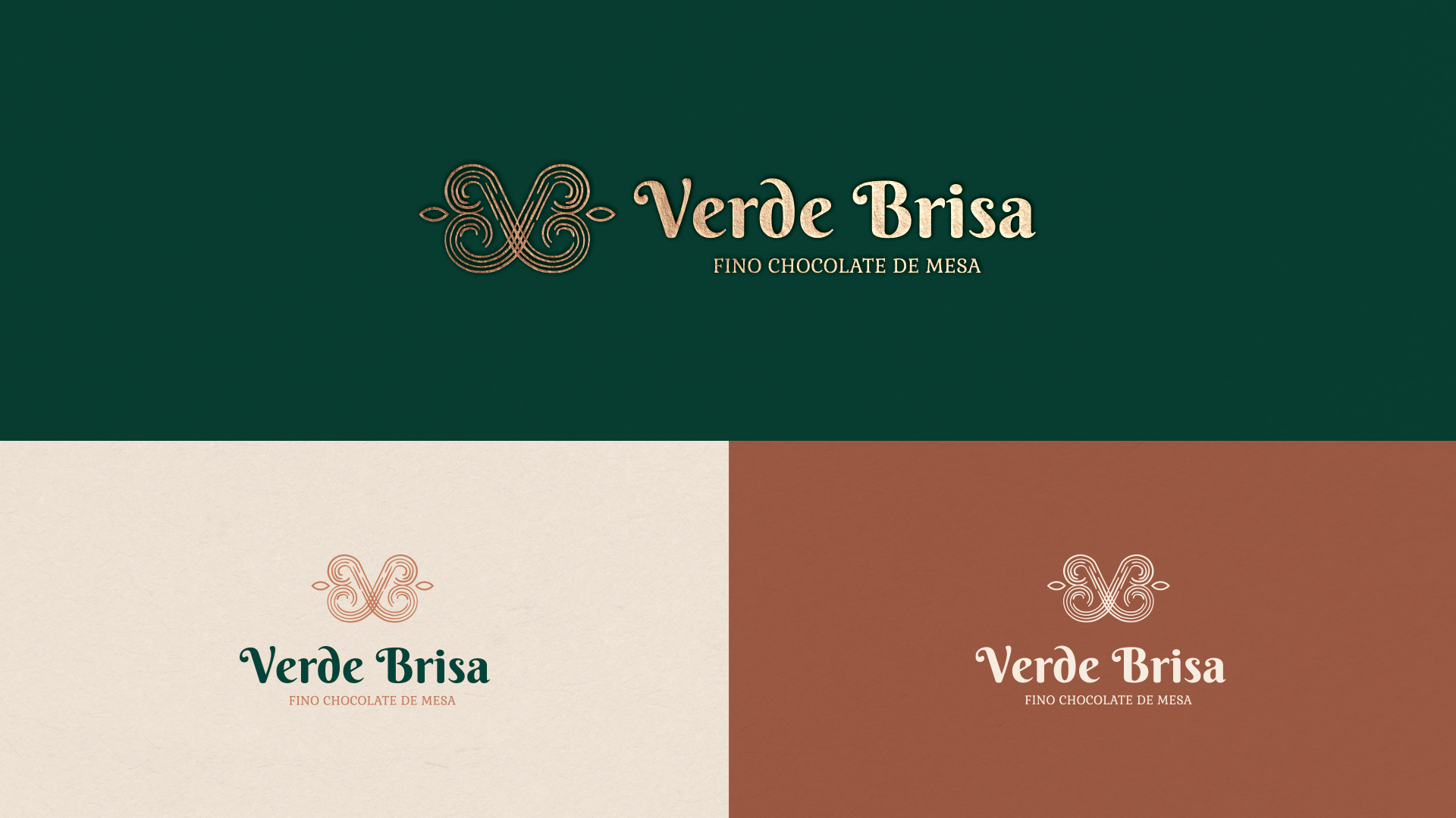
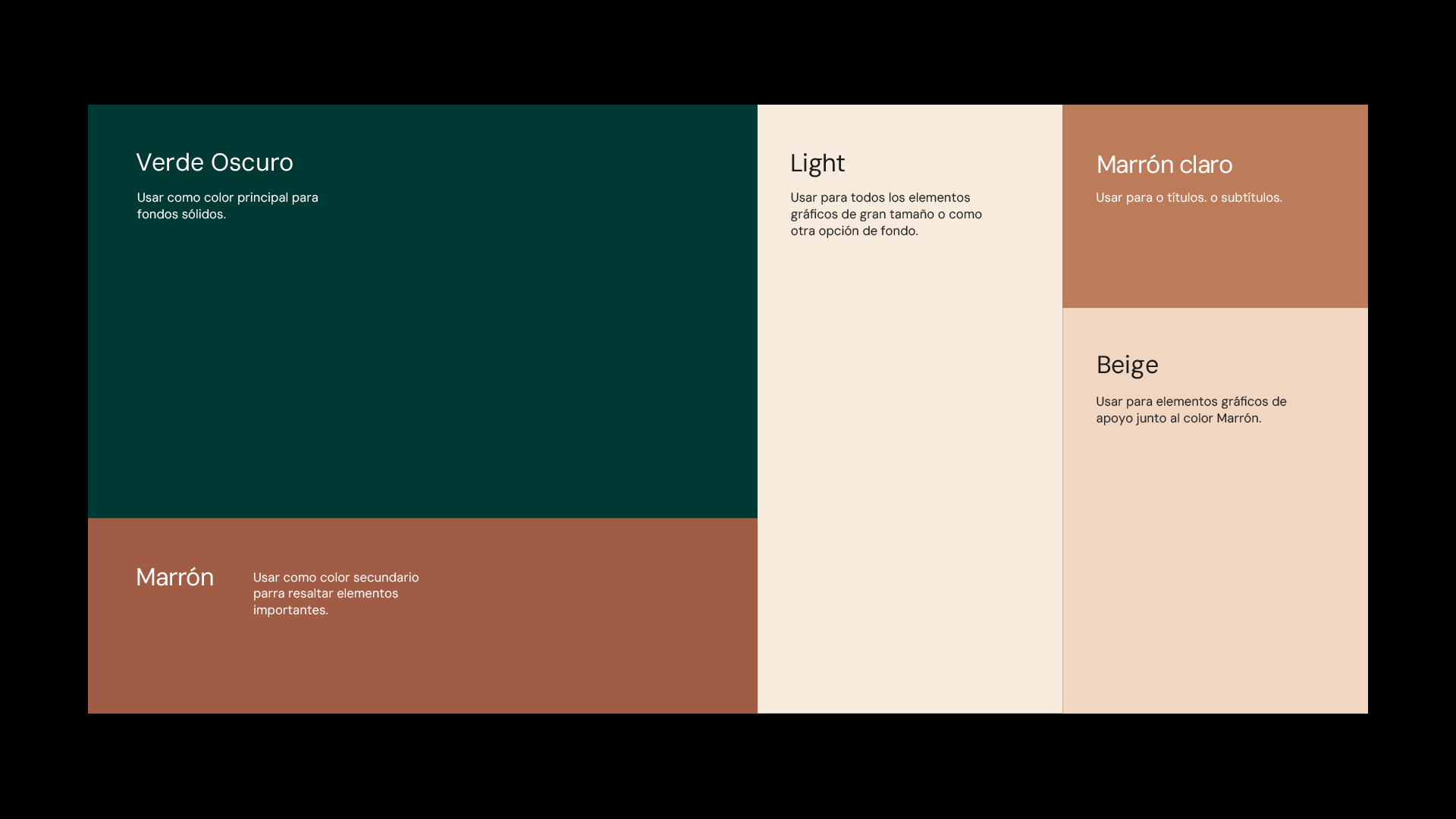
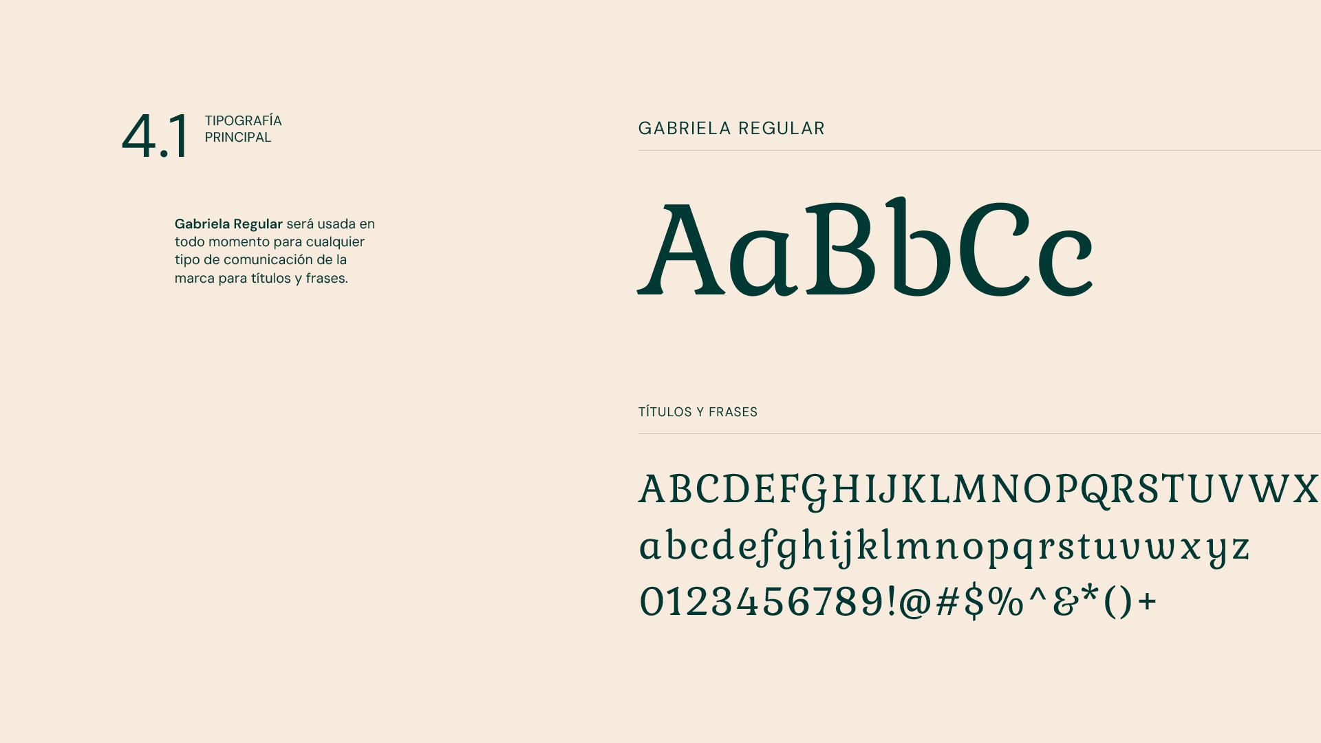
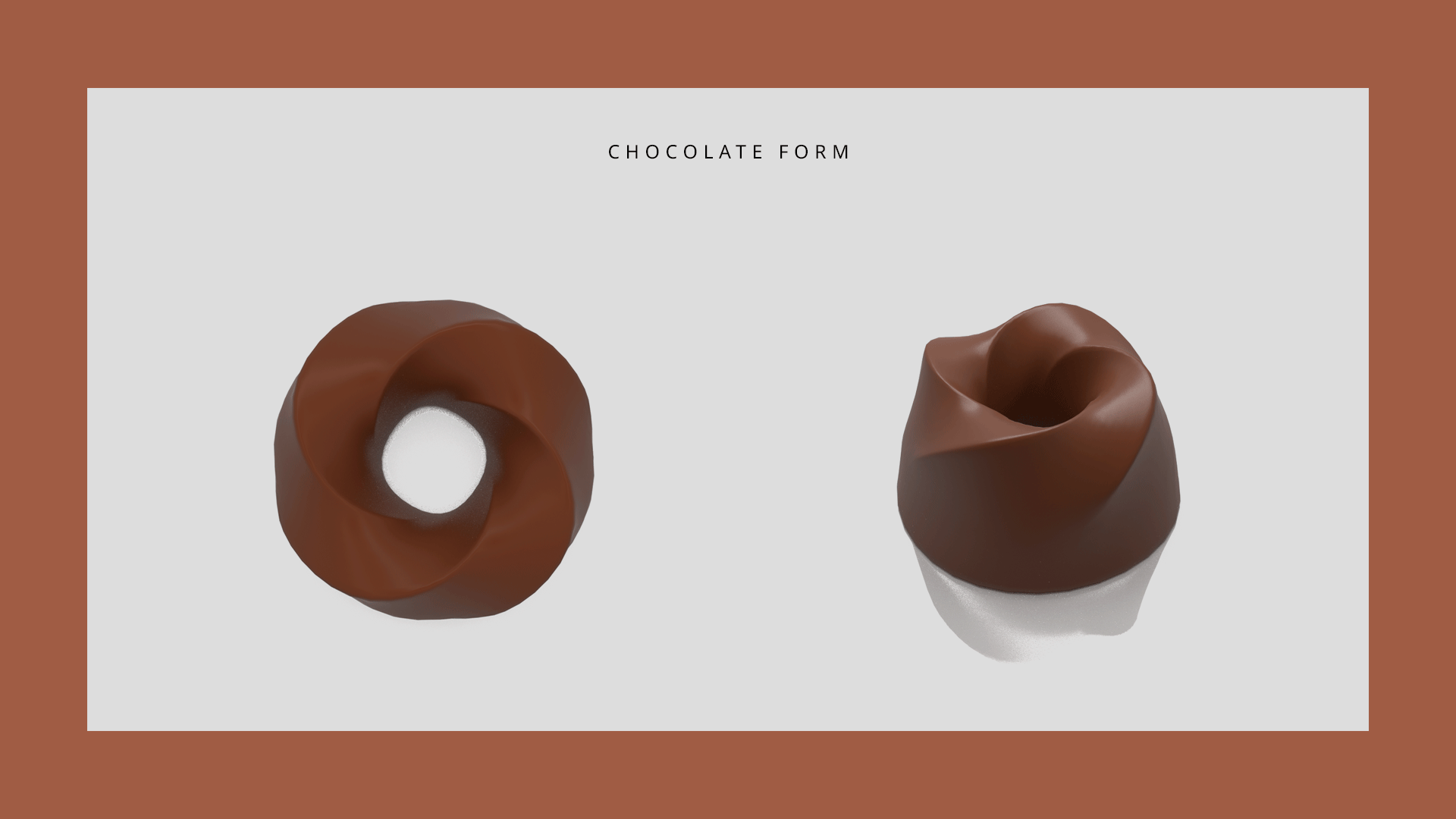
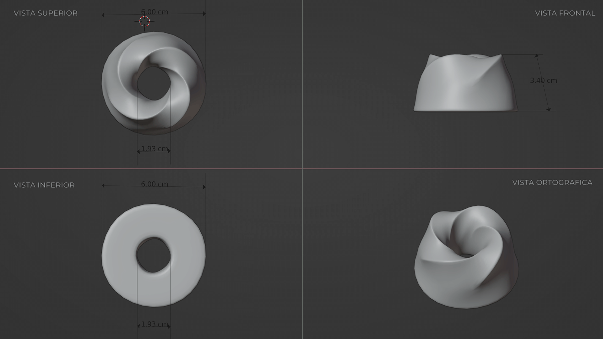
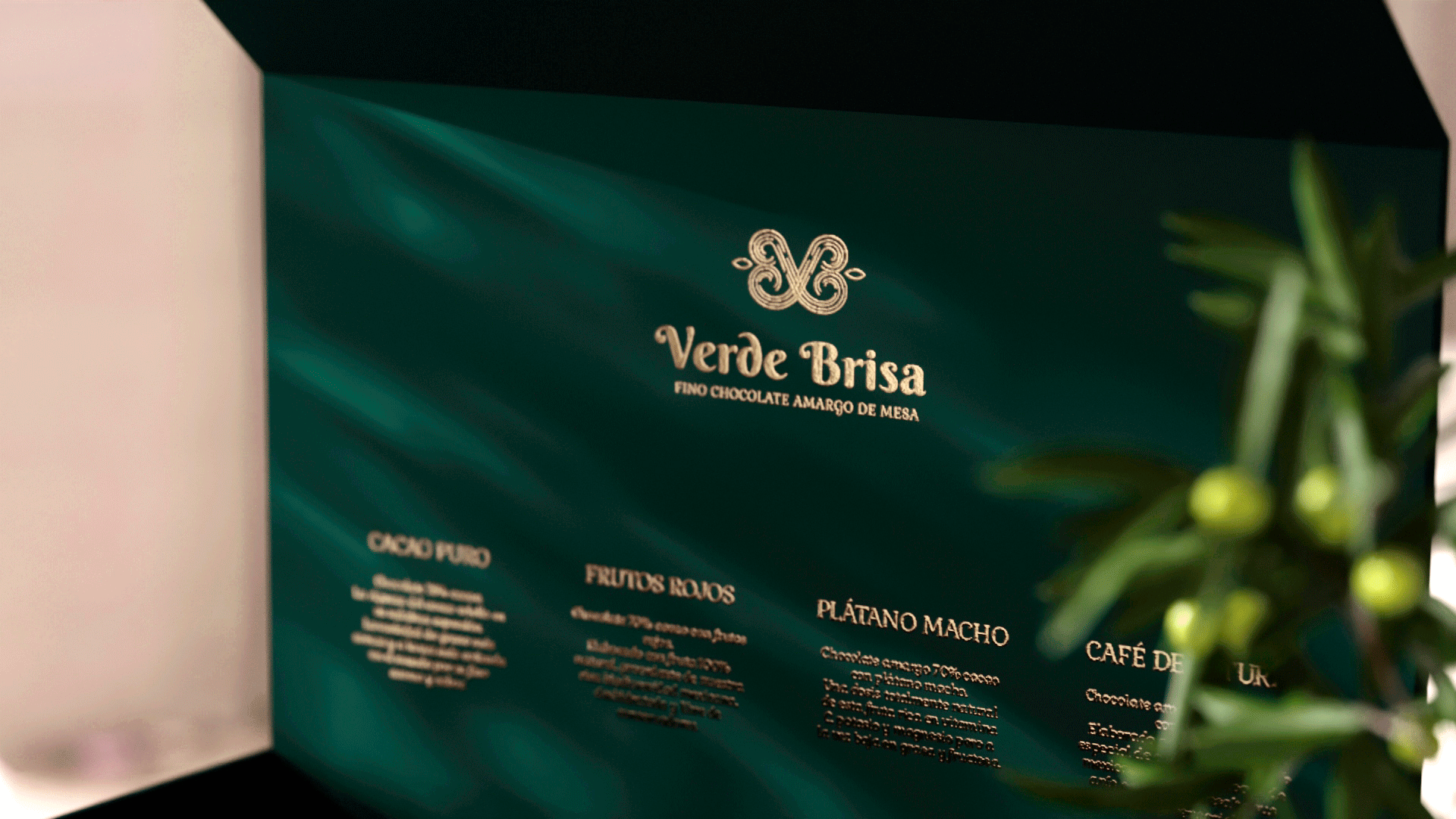
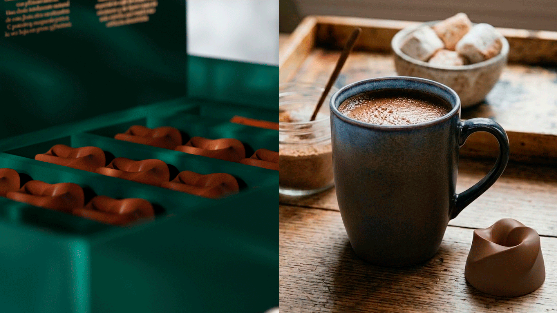
Verde Brisa was conceived as a tribute to Mexico's cacao heritage — reviving authentic artisanal chocolate through natural ingredients and a philosophy rooted in wellness, balance, and respect for nature. The challenge: position a Mexican artisanal chocolate brand in the luxury market without losing the warmth and cultural authenticity at its core. Premium design in this category often defaults to cold minimalism — elegant, but emotionally distant from the product's origin story. The solution was a visual identity built around two opposing forces held in balance: the refinement of luxury and the warmth of craft. The deep forest green palette speaks to nature and provenance. The terracotta tones ground the brand in earth and tradition. The script wordmark — delicate yet confident — bridges both worlds, as does the tagline Que Acaricia el Alma: chocolate that doesn't just taste good, it feels like something. The result is a brand system that performs across premium packaging, chocolate form design, and editorial applications — luxury you can hold in your hands and feel before you taste it.